I love reading. And I’m a longtime user of RSS feeds, from way back when Safari integrated them, to apps like NetNewsWire and others. But with a lot of feeds comes a lot of management, noise, and good things that actually matter to me can get lost. As someone who writes and consults on tough conversations and design, I hold positions on both. It’s easy for those to become calcified, irrelevant, or outdated, which I absolutely don’t want. So I built Cue.
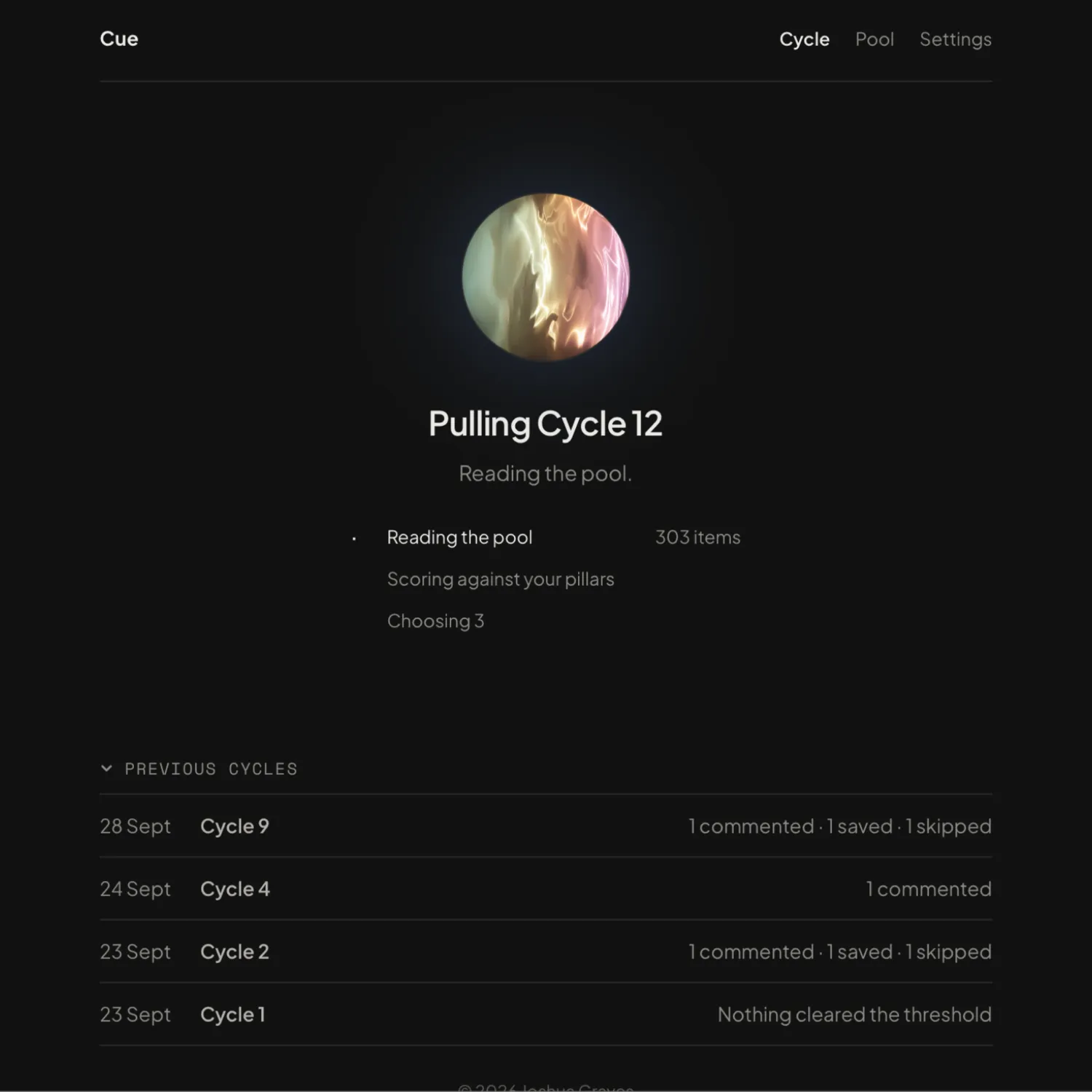
Cue’s built around the concept of cycles. Every 3 days, it pulls from my feeds, recalls a document I made of the pillars and positions I hold (more on that in a moment), scores each item against it, then surfaces 3–5 for me to review and comment on. Some of those will reinforce a position, some challenge it. I want to read all of it so I can continue to build depth in those areas.
I didn’t build social posting into it. It holds the text, and I copy that into another app, which I’ll cover in a future post.
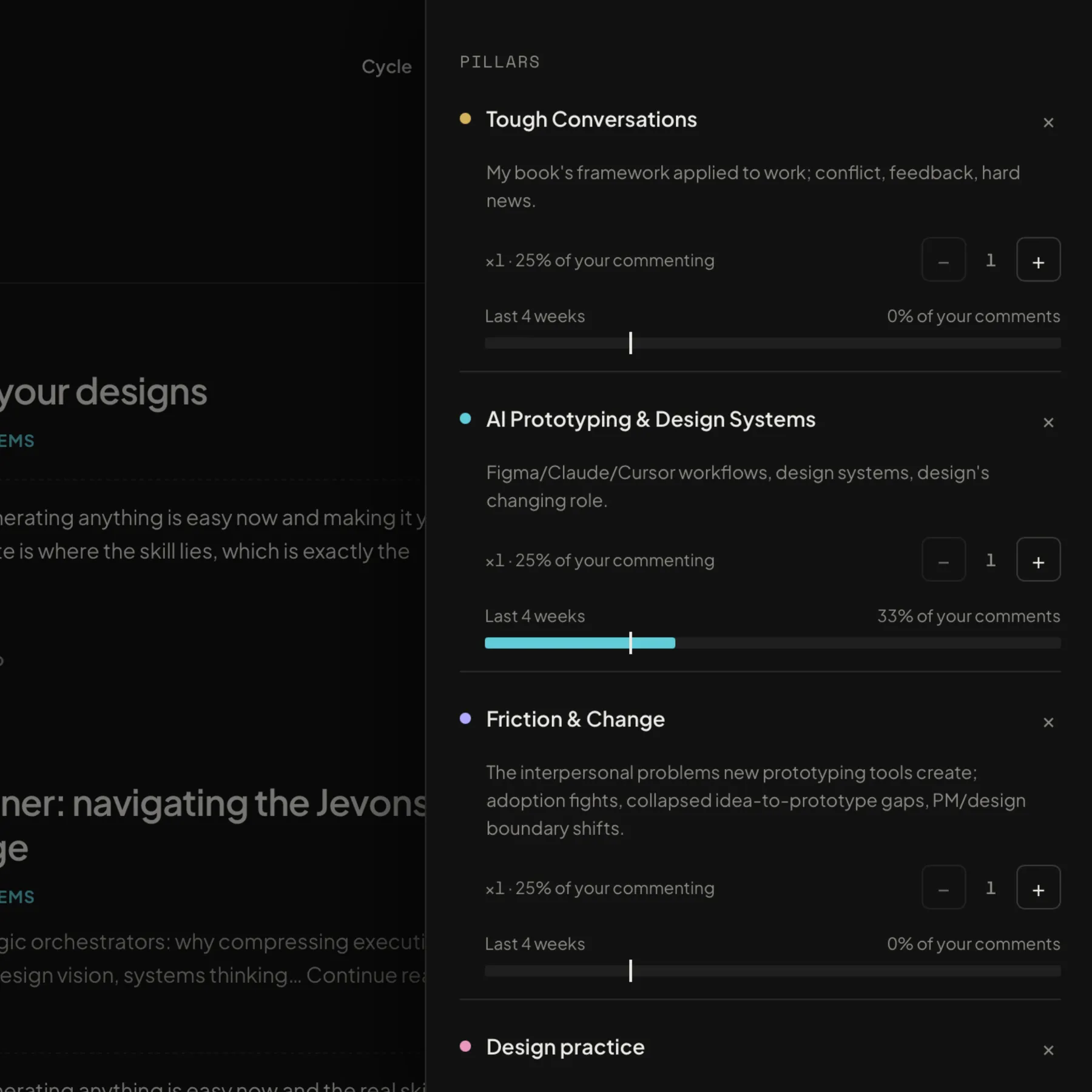
To make it smarter and more personalized, I provided a positions.md document, which contains a few areas of interest and the related positions I hold on them. Cue scores each item in my feed according to how relevant it is to me before it shows anything.
Here’s one example around tough conversations. I wrote a book on it and want to stay sharp, so I filled it in with a few positions:
- Preparation is most of the conversation
- Check in with yourself first through a little mindfulness
- Don’t assume malintent
- Keep facts separate from conclusions
A couple of others were around design practice, AI prototyping and design systems.
And I’d want to ensure that as with any good claim or position, it can be challenged and evolve. So for a few of these, I added what it would take to make me change my mind on a position.
I had the idea when developing this of asking what a person would send me if they knew me. So each item comes with a note: you’ve argued this before, you’ve taken a position on that, this piece will challenge one view and reinforce another. I’m just getting enough to go on and I still have to form the opinion myself.
Claude is in the loop, but it only runs the scoring model against my positions. It doesn’t write anything either, nor does it tell me what to think. And the commenting part I opted to make text that I copy (I’ve built another app to handle posting content, and they may ultimately work together more closely someday, but not today).
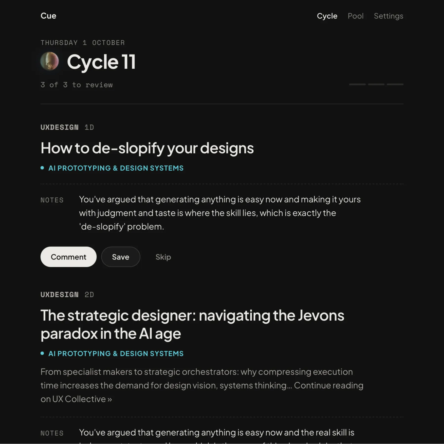
The craft was the fun part. Everything I could think of got thrown in here: micro-interactions, solid typography, buttery-smooth animations. I’m particularly proud of the highlight animations hovering, which also dims other items when you’re reading so you’re focused and distraction-free.
I also got to use WebGL shaders, which I’ve long loved. The orb, which is a central theme for the app, spins up faster and changes color when it’s actively working. I just had as much fun with it as I could.
Design and Build #
The design work bounced around Claude Code, Claude Design, and Figma. There was a prototype in Claude Design that I kept nudging, a Figma file with dark artboards for the moments I wanted to design around and general design direction like the text block, the orb and its states, the cycle screen.
I also used Figma to reinforce a decision that wasn’t easy to convey, it mostly took a backseat here. Most of the design time went to interaction patterns, because this app didn’t behave like every other app I’ve used. Everything hangs off the cycle, and the current one lives on the homepage. There were a few states I designed for here, too, reading the feed, waiting while a cycle processes, redoing it, running another, browsing previous cycles.
Building followed the same pattern as Pantry Bird: hand Claude Code the designs and a scaffolding plan, then build from the ground up in small prompts, each with its own unit tests. It’s deployed on my own server.
Challenges #
Mostly, it was keeping Claude on track with my vision. I hit usage limits on the heavier work, which I used Fable 5.1 for, and switching to a smaller model gave mixed results.
Claude also had difficult understanding the moments I wanted to design around, and I constantly fought with it there. My workaround was to split the idea up into smaller, seemingly unconnected parts, then build on it and connect the ideas from there. Just like I would with a junior designer.
It didn’t quite understand the motion design I wanted, so there was some heavy guidance and editing there.
It also did some silly things, which pushed back on a few things along the way, like:
- It rebuilt the whole cycle screen when I’d asked for one animation update.
- It made three comment actions with conditional fields that would be displayed, I only needed one. It was wildly, unnecessarily complicated.
- A color picker and target percentages for pillars, where I wanted automatic colour and equal weight.
What’s Next #
I’d like the analytics to say something useful about what I’m avoiding. Maybe add podcast processing.
As with other experiments, I don’t have plans for public release. However, if enough people want this bad enough, I’d be open to it.