Table of Contents
Overview & Problem #
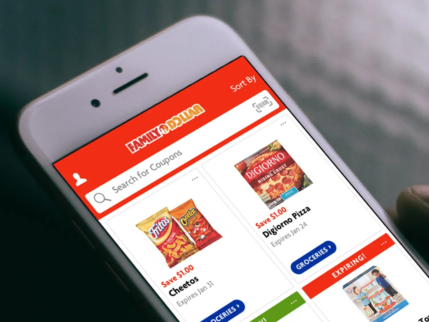
In 2018, Family Dollar set out to launch its first coupon-focused iOS and Android app to modernize savings and improve in-store outcomes. Goals included increasing sales and trip frequency, reducing checkout time, and making couponing more enjoyable for a largely smartphone-novice audience.
Key realities we uncovered early:
- Many customers relied on weekly ads and painstakingly clipped paper coupons.
- Coupons were often lost or expired before use.
- A significant portion of customers weren’t familiar with the App Store and leaned on grandchildren for installs.
I worked as a product designer alongside an information architect, two engineers, a project manager, and a business analyst. I also partnered with Family Dollar’s IT and marketing teams. Although agency-based, we operated as a product team across multiple releases and iterations.
Role #
I led a month-long discovery with key stakeholders to co-create the product vision and define goals, fears, and feature ideas. We prioritized with an effort/impact matrix (favoring high-impact, low-effort work) to align customer needs with the objectives Family Dollar established.
To that end, I:
- Facilitated stakeholder workshops and vision definition.
- Built an effort/impact matrix to drive testable priorities.
- Modeled initial personas from existing research, then validated/augmented them through in-person field interviews.
- Conducted 75+ customer interviews and in-store tests alongside.
- Led interaction and visual design across iOS and Android.


Approach #
I designed, prototyped, and tested prototypes directly in stores to ensure the app worked for customers who had varying levels of familiarity with smartphones. Some key design decisions came from these sessions:
- Card-based couponing UI that mirrors the physical act of clipping, reducing cognitive load and making savings feel tangible.
- Gamification with restraint: a playful “clip” animation and a progress bar that nudged engagement without becoming noisy.
- Educational onboarding tailored for first-time app users, clarifying core actions before account creation or scanning.
- Value-first permission prompts that explained clear benefits before requesting access (e.g., camera for barcode scan), improving opt-in rates.


Results #
- Met yearly download goal in 1 month.
- +50% lift in average transaction value.
- 75+ customer interviews and in-store tests conducted.
- Held a Top 25 spot in Google Play (Shopping) for 18 months.
- Earned a 4.8★ rating in the App Store with over 500k reviews.